An accessible pure CSS toggle switch: one checkbox, appearance: none, role="switch"
A toggle switch is just a checkbox with different looks, and CSS can supply those looks without any JavaScript. The original version of this post used the popular technique of hiding the checkbox and styling its <label> as the switch. It looks fine, but testing it showed that keyboard and screen reader users can't use it at all. This version styles the checkbox itself.
Everything below was tested in headless Chromium 153, Firefox 155 and WebKit 26.6 using the official Playwright Docker image, with identical results in all three engines.
What's wrong with the hidden-checkbox switch
The classic version hides the input and draws the switch on the label:
.csstoggle input[type=checkbox] {
  height: 0;
  width: 0;
  visibility: hidden;
}
.csstoggle label {
  text-indent: -9999px;
  /* …the track and knob are drawn on the label */
}
Clicking it works. But the test pressed Tab on a button placed before the switch, and focus went straight to the button after it:
Tab from "Before" → after; click label → checked=true
accessibility tree: - button "Before" | - text: Toggle | - button "After"
visibility: hidden removes the checkbox from the tab order and from the accessibility tree. A keyboard user can't reach it, and a screen reader announces only the word "Toggle", with no control and no on/off state. The green "on" colour (#bada55) also has a contrast ratio of 1.59:1 against a white page, below the 3:1 that WCAG asks for UI components.
The markup
<label class="switch">
  <input type="checkbox" role="switch" name="emails">
  Email notifications
</label>- It's still a real checkbox, so it submits with the form (
FormDatagave{"emails":"on"}when it was on), it supportschecked,disabledandrequired, and Space toggles it. role="switch"makes screen readers announce it as a switch (on/off) instead of a checkbox (checked/unchecked). Its state still comes from the nativecheckedproperty, so you don't needaria-checked.- Wrapping the input in the
<label>makes the text clickable and gives the switch its accessible name, without anid/forpair.
The CSS
.switch {
  display: inline-flex;
  align-items: center;
  gap: 0.5em;
  cursor: pointer;
}

.switch input {
  appearance: none;
  position: relative;
  flex: none;
  width: 2.75em;
  height: 1.5em;
  margin: 0;
  border-radius: 999px;
  background: #767676;
  cursor: inherit;
  transition: background-color 0.2s;
}

/* The knob */
.switch input::before {
  content: '';
  position: absolute;
  top: 0.1875em;
  left: 0.1875em;
  width: 1.125em;
  height: 1.125em;
  border-radius: 50%;
  background: #fff;
  transition: translate 0.2s;
}

.switch input:checked {
  background: #2563eb;
}

.switch input:checked::before {
  translate: 1.25em 0;
}

.switch input:focus-visible {
  outline: 2px solid #2563eb;
  outline-offset: 2px;
}

.switch input:disabled {
  opacity: 0.5;
  cursor: not-allowed;
}

@media (prefers-reduced-motion: reduce) {
  .switch input,
  .switch input::before {
    transition: none;
  }
}

/* Windows High Contrast and other forced-colors modes drop backgrounds */
@media (forced-colors: active) {
  .switch input {
    border: 1px solid CanvasText;
  }
  .switch input::before {
    background: CanvasText;
  }
  .switch input:checked {
    background: Highlight;
  }
  .switch input:checked::before {
    background: HighlightText;
  }
}
How it works:
appearance: noneremoves the native checkbox drawing, leaving a plain box that you can style like any element: here, a rounded track. It's supported in Chrome 84, Firefox 80 and Safari 15.4.- The knob is
::beforeon the input itself. Whether a form control renders::beforehas historically varied between browsers, but withappearance: noneall three engines rendered it. The test read the computedcontentas"", and the knob is visible in every screenshot. - Sizes are in
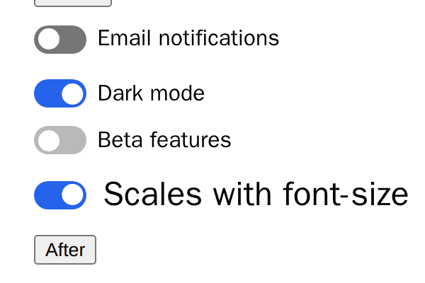
em, so the switch scales with the surrounding text, like the last switch in the screenshot (24px). translatemoves the knob, and the transition only animatestranslateandbackground-color.- Colours: the off track
#767676has a contrast ratio of 4.54:1 against white, and the on track#2563ebhas 5.17:1, both above the WCAG 3:1 minimum for UI components. A disabled control is exempt, soopacity: 0.5is fine there.
Keyboard, screen readers and motion
The same test as before, run on the new switch:
Tab → #emails; Space → checked=true; FormData {"emails":"on"}; click text → checked=false
accessibility tree: - switch "Email notifications"
Tab lands on the switch, Space toggles it, clicking the label text toggles it, and it's exposed as switch "Email notifications". :focus-visible shows the outline only for keyboard focus, not after a mouse click:

With prefers-reduced-motion: reduce emulated, the knob's transition-duration computed to 0s in all three engines, so it jumps instead of sliding.
Forced colors (Windows High Contrast)
In forced-colors mode the browser replaces your colours with the user's system palette, and a switch drawn only with backgrounds can disappear. The @media (forced-colors: active) block draws the track with a border, and the knob and on state with system colour keywords. This is how Chromium rendered it with forced colours emulated:
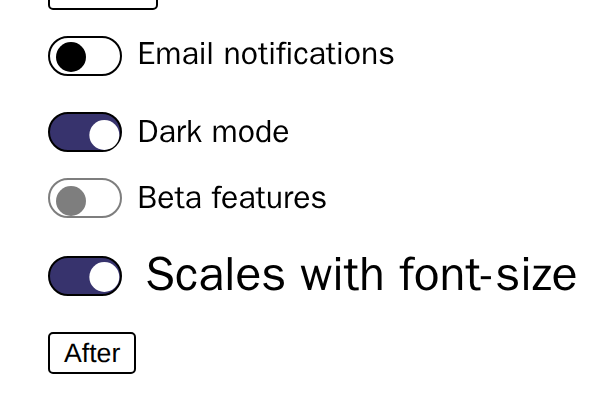
The first version of this CSS used CanvasText for the knob in both states, which put a black knob on the dark Highlight track. That's why :checked::before switches to HighlightText.
What about <input type="checkbox" switch>?
Safari 17.4 added a switch attribute that renders a native iOS-style switch. According to MDN's compatibility data it's Safari-only, experimental and not on the standards track. Chrome and Firefox ignore it and show a normal checkbox, and so did Playwright's WebKit build ('switch' in HTMLInputElement.prototype was false). Adding it does no harm, since other browsers just ignore the attribute. But with appearance: none your own styles win anyway, so the CSS above is what users actually see.