Home → Prevent CSS column break within an element
Prevent CSS column break within an element
By Alexander Kuzmenok · Node.js & JavaScript developer
Published January 22, 2023
You might have had this while using the CSS columns rule and getting rid of all those JavaScript libraries. One of the elements got suddenly cut and wraps to the next column.
Let's look at this simple example of CSS columns. First, the HTML:
<div class="columns">
  <div>Item 1</div>
  <div>Item 2, which is slightly longer</div>
  <div>Item 3, which is also longer and jumps to next column</div>
  <div>Item 4</div>
  <div>Item 5</div>
  <div>Item 6</div>
</div>
Now, the accompanying CSS:
.columns {
  columns: 2;
  width: 400px;
  background: #fafafa;
  padding: 10px;
  margin-bottom: 15px;
}
.columns > * {
  background: white;
  border: 1px solid #f3f3f3;
  padding: 5px;
}
Run that, and you will see how one of the items got cut and wrapped to the second column:
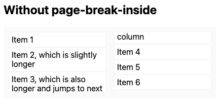
That looks ugly, the border got interrupted, the padding is zero, and the overall item presentation is broken. The simplest way to fix that is to apply the page-break-inside rule to every item of the column with the value of avoid:
.columns > * {
  page-break-inside: avoid;
}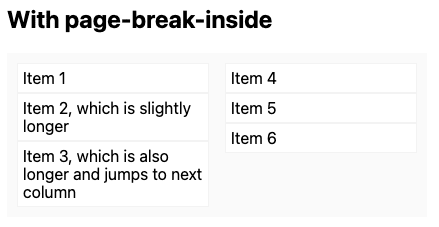
And that's it! All items are neatly arranged, without any borders or backgrounds being cut.